The Print Advert:
The Radio Advert:
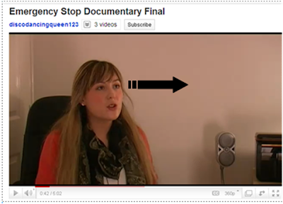
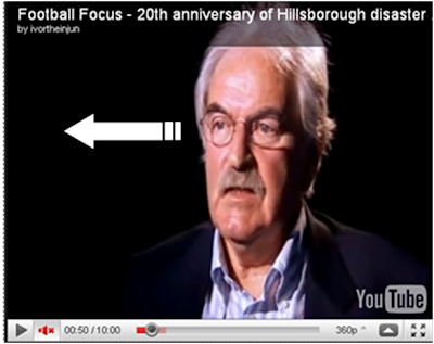
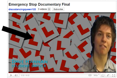
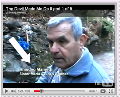
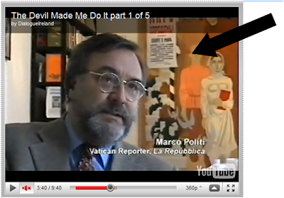 Here you can see that the Mise-en scene is very important in explaining what the interviewee is talking about and it realates so that the audience have more knowledge of the topic. For example Dave a learner driver we interviewed, had L plates ontop of eachother as the background and here I have compared it to an professional documentary interview and the mise en scene relates to what the interviewee is talking about.
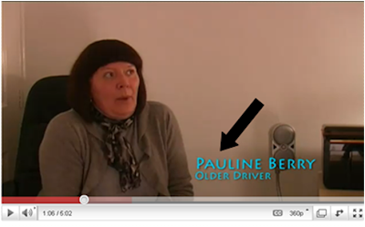


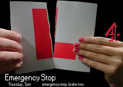
is examples of print adverts and I have compared them both to see any differences in professional work and ours. The title,date and the time it is on is in the bottem left hand corner as seen in both images. The channel 4 logo is in the centre right hand side of the print advert this is shown on both images again, therefore shows how we have conformed to the normal codes and conventions of real media products.
My Radio advert, has a music bed aswell as other real media documentaries, this is showing how that It is conforming with the rules of a radio advert.
Q2. How effective is the combination of your main product and ancillary texts?
Q3. What have you learned from your audience feedback?
Q4. How did you use media technologies in the construction and research, planning and evaluation stages?
In the planning of our documentary 'Emergency Stop' we decided to use alot of different technologies, for example Archive footage, cut aways and vox pops. This will make the documentary less boring and make it more enjoyable to watch. When we interviewed people ad filmed our vox pops we decided to ask people questions like 'what is your favourite colour?' As well as questions about driving which will then help us decide on the colour we will use for our titles.
After all the planning for our documentary had been done we then needed to get some research that was relevant to driving, the research also needed to be up to date and include statistics to make our documentary more realistic.

We then started to edit our documentary and by doing this we had to look out for information and archive footage on the news that would help us keep our documentary modern and original. The footage had to be interesting so that our target audience would actually want to watch it and not get bored. For our archive footage we decided to use Top Gear because this programme is modern and up to date therefore people can relate to our documentary, also as this is already a TV programme so we know that people enjoy watching it. Here is a link where we got our archive footage from www.bbc.co.uk/iplayer
We also decided to use footage from the film Final Destination 3 within our documentary because this film is a modern film therefore the audience will be interested. We stuck with the idea of using modern up to date footage because the programmes and footage will still be fresh in our audience's minds. Whilst editing our documentary Emergency Stop, we worked on a range of different things like aligning different interviews so that the framing would look more professional.

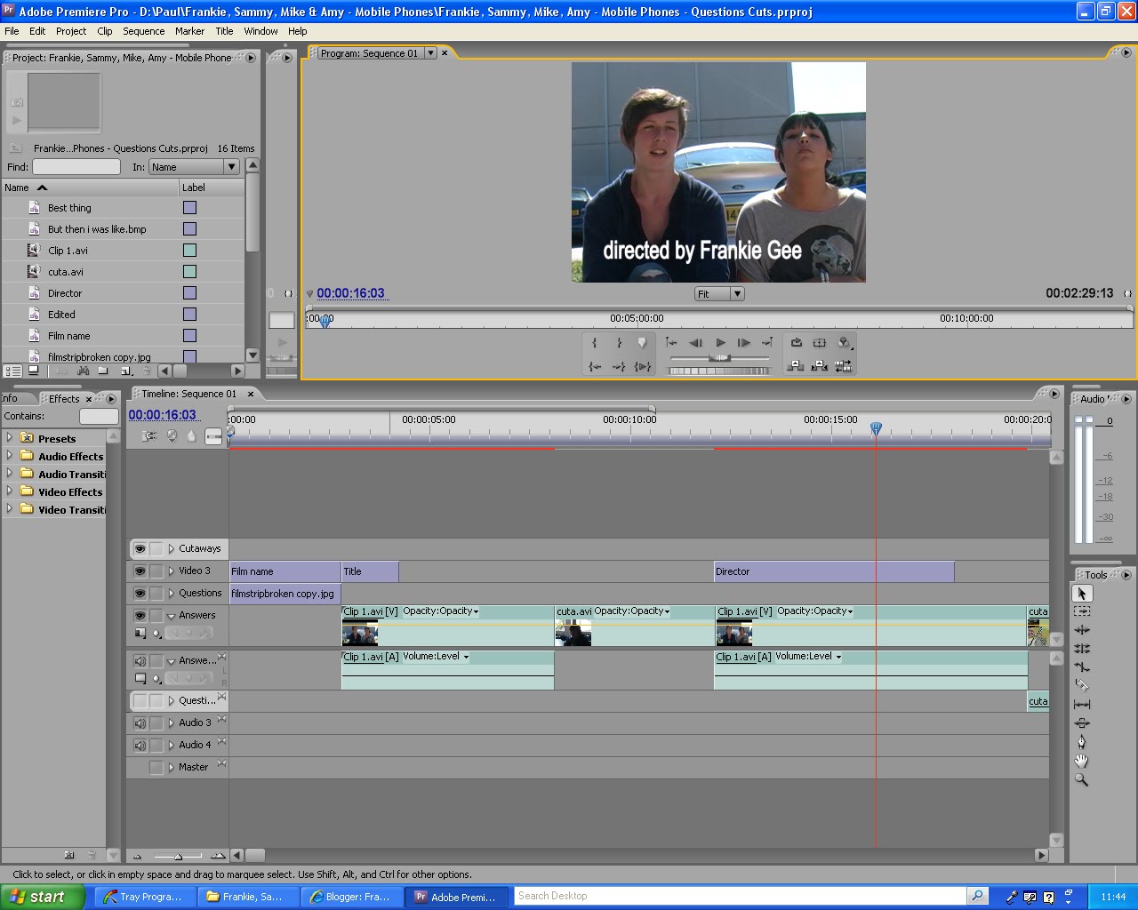
Also we worked on putting a background onto a Bluescreen we used for an interview as shown below. When we where using Premier Pro we were able to watch two different clips this ment we could cut down and work on two different clips at the same time, therefore we could see if we could use a different clip as cut aways or footage that could be placed over our voiceover.

We also used a cutting tool which we could use to cut out anything we didn't want to put into our documentary. Once had edited our documentary we started to work on our print advert doing this we opened Photoshop and decided on using a ripped red learner plate as our main focus image because this relates to learner drivers and to our target audience however will also reach a bigger audience than just learner drivers. After we had chose our image for the main focus of our poster we then added a coloured background to it just to see what it would look like.
 The next thing we did was to add the Channel 4 logo onto our poster this shows what channel our documentary would be on for the viewers. Originally we wanted to use the colour blue on our poster because this was the favourite colour our target audience chose however we then changed our minds to red because this stands out alot more and pulls the viewers in, also people relate the word 'STOP' to the colour red hence the name of our documentary 'Emergency Stop'.
![]()

In our documentary there are things I liked and things I disliked for example some of the things I liked where the background music we chose, I think it fitted very well with the whole idea of our documentary. However I think the music could have faded in with the clips a little bit better as it just cuts off instead of the voume just being lowerd so that you can still hear the peoplebeing interviewed over the background music. So that is one thing I would change if I where to do this project again.
I like how one of the interviewees plays her Beyonce ringtone and both start to dance to it because this shows the funny side to ur documentary that we where trying to get across to the audience. Also the cut aways we used I think works well because they where not too long and the pans we used looked professional and works well with the music.Instead of jump cuts we used cross dissolves on the start and beggining of each clip to make it more 'mtvish'.
On the other hand I think that we could have had a better ending to our documentary as it just cuts to black and the music just cuts out, I think If we where to do this again I would have the music fading out and also mayby the last clip fades out also. I woud use the mics we where given access to because this would have given us better sound quality.